The QURI Logo and Reflections on 99 Designs
A retrospective look at designing the QURI logo
Meta: This was initially posted on our regular QURI website on May 2021. We moved it here to cumulate all of our content.
We've used 99 Designs to come up with a logo and simple brand. This was our first time trying 99Designs. You can see the design brief, with all the design candidates, here.
Throughout this process, we've posted several surveys to collect feedback on logo options. Many thanks to all those who participated, the feedback was fairly decisive in our choices.
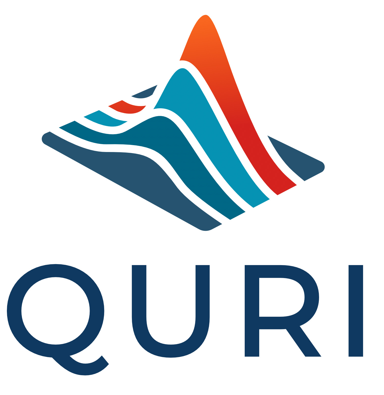
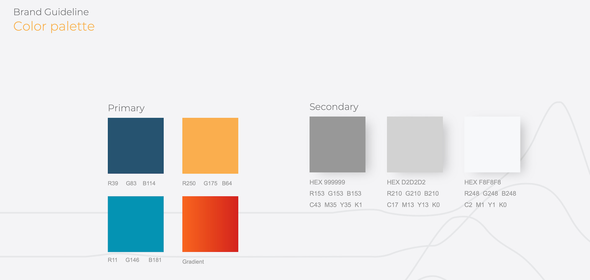
Key Deliverables
Reflections on the process with 99Designs
This was our first time using 99Designs. Overall, it seemed beneficial. It took more time than expected, mainly because we started with few ideas on what the logo should be. Many of the original options were all fox-based, likely because our homepage had a fox on it, even though we weren't particularly interested in fox logos.
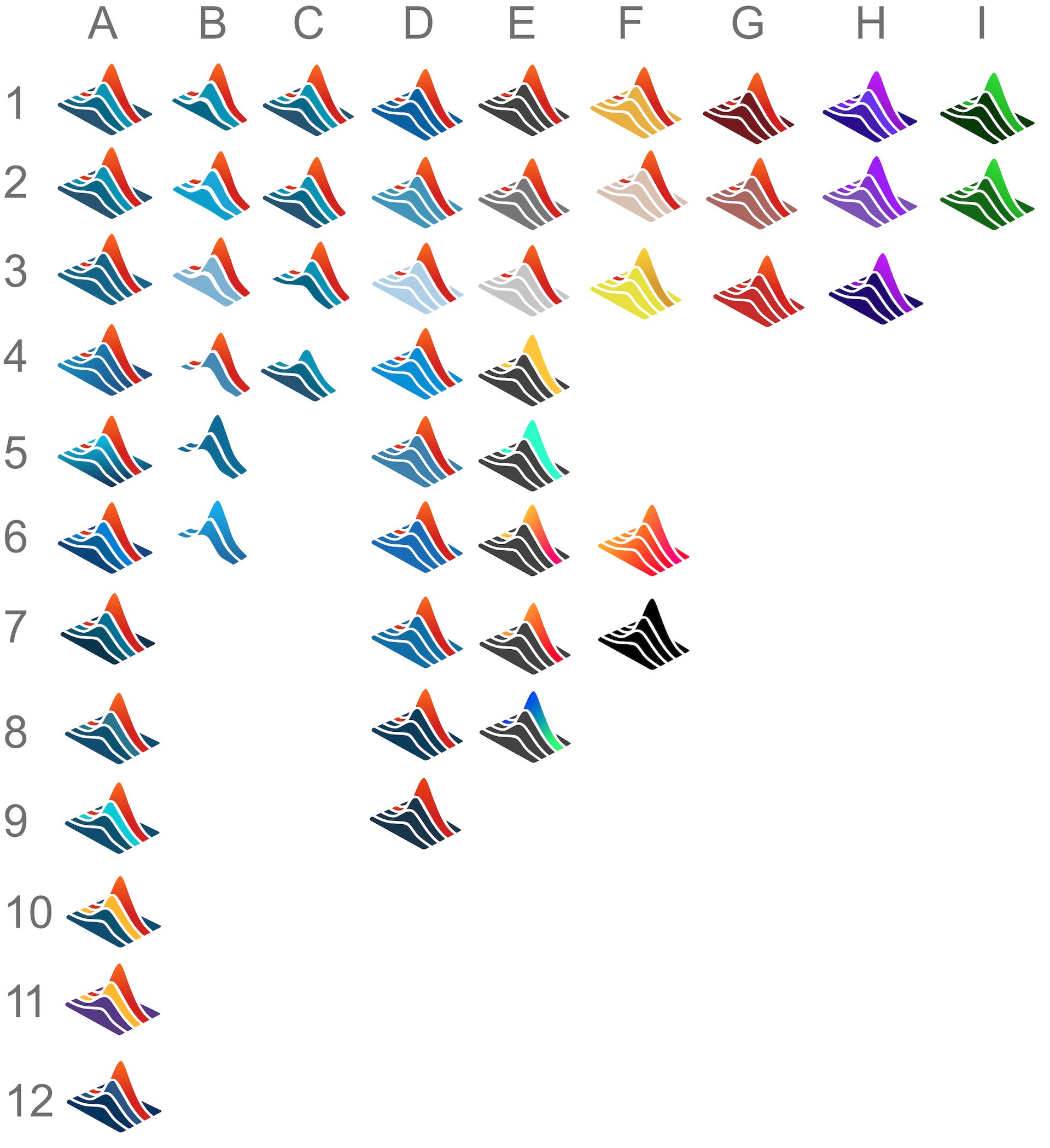
This process was useful for getting a bunch of different iterations. We wound up getting 670 designs total. The downside is that most were very simple or derivative of one another. 99Designs has a set of "Senior" designers, but very few competed in this competition.
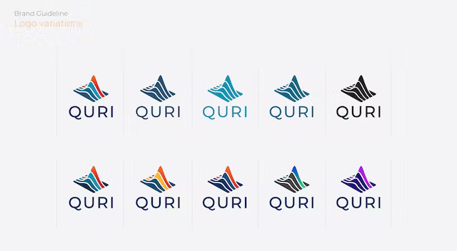
Once we had the final basic shape, we realized we would probably have to try color variations ourselves to figure out what to recommend. Below are some of the options we played with, for those curious. We like the idea of being able to change the colors a bit later on, perhaps for various applications.